App icons usually start in design tools. Figma, Sketch, Affinity. You drag shapes, pick colours, group them, export to a 1024×1024 PNG, and drop the file into Xcode. The artifact you ship is a snapshot of something that lives somewhere else.
For Signal Recorder SR-7, the icon never left the codebase.
The Visual Was Already There
SR-7 the app has its own reel-to-reel — a small animation built into the recording UI that signals tape is moving. When we built the SR-7 product page, we lifted the same look out of the app and rendered it there too, as a canvas script that calculates tape paths, tangent points, and roller arcs from first principles. Two reels, a tape line that wraps the spools and threads through guides and across a head. Animated, mathematically grounded.
So when the time came to design an icon, the visual foundation was already in place. The icon didn’t need to invent a new identity — it needed to inherit the one already running in the app and on the website. App → product page → icon. Same DNA, three different surfaces.
The obvious next step was to reach for Figma. The less obvious one was to ask whether we needed to leave the codebase at all.
We didn’t. The icon became an Astro page that serves a single 1024×1024 SVG. Every iteration is a code edit. Every render is the real thing. There’s no export step, no fidelity loss between design and ship, no second source of truth to keep in sync with the website.
Designing in the Medium
Most design tools are abstractions. You drag shapes through a UI, group them, name layers. The abstraction is convenient, but it sits between you and the file you’ll actually ship.
In SVG, the reel flange is a <circle r="210">. The spokes are <line> elements with stroke-width="12". The black panel at the bottom is a <rect> with a vertical gradient. There’s nothing between intent and output. A change to a stroke width is one number. A change to a colour is six characters. The browser repaints in milliseconds.
For the more complex parts — the tangent points where the tape meets the wound spool, the arcs around the rollers — we extracted the math directly from reel.js and ran it as a build-time script. The icon and the website now share the same geometry. If the reels on the product page rotate, they rotate around the same axis the icon depicts.
And here’s what makes the medium choice matter so much right now. Everything is ultimately code, and code is just language. SVG isn’t a graphics format with a UI bolted on — it’s structured English. A circle is a <circle>. A radius is r="210". A colour is six hex characters. The whole file reads almost as a sentence. When the medium itself is language, and your collaborator speaks language, the gap between describing a design and making it disappears. Language becomes the medium.
Iterating in Conversation
Most of the work happened in conversation with Claude. Small edits, mostly. Make the spokes wider. Stop them just short of the rim. Centre the speaker grid horizontally with the left reel. Darken the divider bar. Reduce the red record dot a little. Now make it brighter and add a glow.
Each instruction became an SVG edit, each edit became a render, each render became the next prompt. The collaboration felt less like operating a tool and more like sketching alongside someone with a steady hand. The friction of “open Figma, find the layer, drag the handle, export, drop in” collapsed into “say what you want, look, decide.”
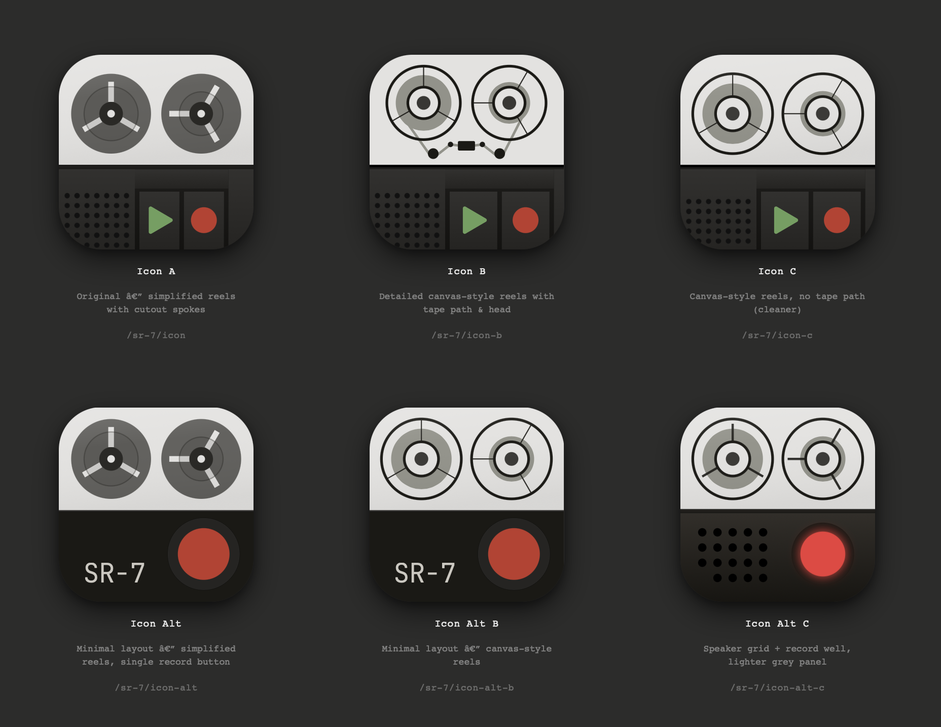
Some decisions only became clear by trying both. We made an “alt” version with the controls dropped to a single record button on a flat panel. Then a “B” of each, swapping the simplified reels for the canvas-style detailed ones. Then a “C” with the speaker grid pulled across. Six variants in total, each one a small fork of the same SVG.
The Variants
Every variant lives at its own URL. They share defs and layout language but diverge in composition. Some are “control deck” — the reel-to-reel above a panel of rocker buttons, a speaker grill, a black divider seam. Others are minimal — two reels and a single record button on a darkened panel, nothing else.
The overview at /sr-7/icons reads each icon’s source file at build time and renders all six side by side at 256 pixels. Add a variant or change a colour and the gallery updates automatically.
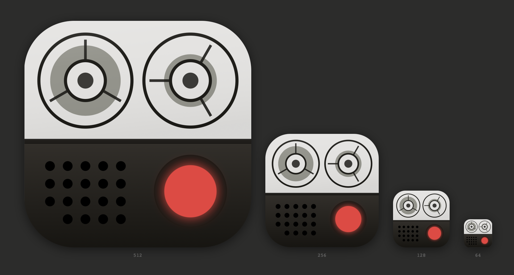
The skeuomorphic versions — the full control decks with their buttons, speakers, and seams — were the most enjoyable to design. They felt closest to SR-7’s hardware-inspired sensibility, the same instinct that draws us to old Braun radios and reel-to-reel decks in the first place. But icons aren’t product photos. They have to read at 64×64 in a Dock or a menu bar, where fine detail collapses into mush. The version we ended up shipping is one of the more graphical, abstract variants — the same inherited reel-to-reel, stripped down to the elements that still survive at small sizes.
Why It Worked
Three things made designing in code feel right.
The medium is the same as production. There’s no translation layer where things might drift, no separate canvas to maintain.
The feedback loop is faster than any design tool. Refresh, look, decide.
The collaboration is conversational. Working with an AI partner means describing what you want and watching it appear, not learning a tool’s UI.
We didn’t set out to write a love letter to designing in code. We needed an app icon, and the path of least resistance turned out to be the one that kept the design as close to the product as possible.